


CRI, or Color Rendering Index, measures how accurately a light source reveals true colors compared to natural daylight, on a scale from 0 to 100. For most living spaces, aim for a CRI of 90 or higher; a CRI around 80 is commonly suitable for garages or closets. Check the spec sheet for R9 (a measure of deep red rendering) and, on better fixtures, TM-30 data, since two bulbs with matching CRI numbers can still look noticeably different in person.
TL;DR:
- CRI of 90 or higher is recommended for kitchens, bathrooms, and art displays to ensure accurate color reproduction, especially for reds and skin tones.
- Many LED fixtures with high CRI still have weak R9 scores, which affects red color accuracy and can make produce and furniture look dull.
- TM-30 provides a more comprehensive color measurement than CRI, testing hundreds of samples and reporting fidelity and gamut scores.
- The impact of CRI varies with color temperature, as warm bulbs can mask deficiencies better than cool lighting at the same CRI level.
- Always check for R9 and TM-30 data when choosing lights for critical color tasks rather than relying solely on advertised CRI.
Table of Contents
- Understanding CRI Lighting: The Basics Behind the Number
- How CRI Is Measured, and Where It Falls Short
- Why CRI Matters More in Some Rooms Than Others
- What Do CRI Numbers Actually Mean? A Quick Reference
- How to Choose CRI Lighting: A Checklist for Canadian Shoppers
- How Color Temperature Changes the Way CRI Looks
- Real-World Proof That CRI Isn’t the Whole Story
- Publisher Perspective: How Montreal Lighting & Hardware Approaches CRI
- Find High-CRI Fixtures Without Guessing at Spec Sheets
- Sources
Understanding CRI Lighting: The Basics Behind the Number
CRI compares how a light source renders color against a reference light of the same color temperature, typically a black-body radiator or daylight source. A perfect score of 100 means colors look exactly as they would under that reference. Incandescent and halogen bulbs land at or near 100 essentially by definition, since they’re the traditional benchmark most scales were built around. LEDs are a different story entirely, and that’s where understanding CRI lighting actually pays off for your home.
Here’s how common sources typically stack up:
- Incandescent and halogen typically have CRI near 100
- Tri-phosphor fluorescent tubes typically score in the mid-to-high 80s
- Standard consumer LEDs often have CRI around 80
- Premium LED products may reach CRI in the mid-90s or higher
One thing trips people up constantly: CRI and color temperature (measured in Kelvin) are not the same measurement. Color temperature tells you whether a light looks warm and amber or cool and blue. CRI tells you how accurately colors render once you’re under that warm or cool light. You can have a gorgeous 2700K warm white bulb with mediocre CRI that makes your kitchen tile look flat, or a clinical 5000K bulb with excellent CRI that renders every color true. They’re independent variables, and a lot of packaging conflates them.
How CRI Is Measured, and Where It Falls Short
CRI, formally called Ra, gets calculated by testing a light source against eight standardized color samples labeled R1 through R8, then averaging the results. Those eight samples lean toward moderate, muted tones. Nothing wrong with that math, except for one glaring gap: saturated red, known as R9, isn’t part of the average at all.
That omission matters more than it sounds. R9 governs how true reds appear, which affects:
- Skin tones (redness, warmth, healthy color)
- Fresh food and produce displays
- Wood grain and warm wood tones
- Fabrics and textiles in rich reds or burgundies
A fixture can advertise CRI 90 and still have an R9 score in the single digits. This happens often with blue-pumped phosphor LEDs, the most common LED design on the market. The Ra number looks great on the box. The tomatoes in your kitchen look gray under it.
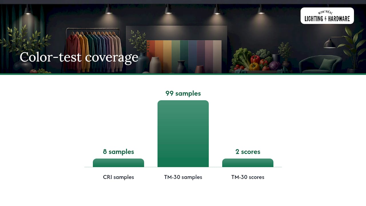
Quick fact: CRI is an average of only eight color samples, while the newer TM-30 standard tests against 99 samples and reports two separate scores, Rf for fidelity and Rg for gamut. That’s a far more complete read on color performance, and designers increasingly ask for TM-30 data on specification-level projects rather than relying on Ra alone.
If a spec sheet lists CRI but skips R9 and TM-30 entirely, that’s not necessarily a dealbreaker for a hallway light. For a kitchen island or a vanity mirror, it’s worth asking the retailer directly.
Why CRI Matters More in Some Rooms Than Others
CRI isn’t an abstract lighting spec. It shows up the moment you look in a mirror, plate a meal, or hang a piece of art under the wrong bulb.
- Kitchens. Low CRI light mutes reds in produce and meat, making even fresh food look slightly off. This is the room where a jump from CRI 80 to 90 is most visible day to day.
- Bathrooms and vanity areas. Skin tones shift under poor color rendering, which is why makeup applied under bad bathroom lighting can look wrong the moment you step outside.
- Artwork and gallery walls. Paintings and prints rely on nuanced color separation. Weak CRI flattens shadows and mutes contrast between similar hues.
- Retail and hospitality. Product displays and dining rooms need color accuracy to make merchandise and food look appetizing, which is part of why restaurant lighting design treats CRI as a baseline spec, not an afterthought.
- Living rooms with wood furniture or textiles. Wood grain and fabric texture read as dull and one-dimensional under low CRI, even when the room feels bright enough.
One more wrinkle worth knowing: some LED drivers shift their spectral output as they dim, meaning a bulb’s color rendering at full brightness doesn’t always hold at 20%. If you dim frequently, that’s a separate spec to check.
What Do CRI Numbers Actually Mean? A Quick Reference
Here’s the practical breakdown for shopping:
| CRI Range | Quality Level | Best Used For |
|---|---|---|
| Below 80 | Poor | Storage, utility areas only |
| 80 to 88 | Acceptable | Hallways, garages, closets |
| 90 to 93 | Excellent | Kitchens, living rooms, bathrooms |
| 95 to 100 | Exceptional | Galleries, retail displays, makeup stations |
Design guides generally recommend CRI 90 or higher for any room where you’re evaluating color, whether that’s your reflection, your dinner, or your décor. The catch is that very high CRI sometimes comes with a trade-off: manufacturers occasionally sacrifice some luminous efficacy or add cost to push a fixture toward CRI 95 and above. For most homes, CRI 90 hits the sweet spot between accurate color and reasonable pricing.
How to Choose CRI Lighting: A Checklist for Canadian Shoppers
Standing in front of a wall of bulbs or scrolling through fixture listings, here’s what actually deserves your attention.
- Find the CRI or Ra number first. If it’s missing from the packaging, that’s often a sign the product sits below CRI 80, which reputable manufacturers rarely hide.
- Look for R9 on premium products. A published R9 score signals a manufacturer confident enough in red rendering to share it.
- Check TM-30 (Rf/Rg) on designer fixtures. Not every product lists it, but when it’s there, it’s a stronger signal than CRI alone.
- Read color temperature and lumens alongside CRI. A 2700K bulb at CRI 90 will feel completely different from a 4000K bulb at the same CRI, even though the color accuracy is equal.
- Ask about dimming behavior if the fixture will run on a dimmer switch regularly, since driver quality affects color stability at low output. Our guide to LED driver types breaks down what to look for.
- Match the CRI to the room’s job. Save the 95+ fixtures for kitchens and display areas; save your budget on closets and mechanical rooms with CRI 80.
Pro Tip: Bring a small object from home, like a paint swatch or a piece of fruit, when you’re shopping in person. Holding it under a few different bulbs tells you more in ten seconds than any spec sheet.
How Color Temperature Changes the Way CRI Looks
CRI and color temperature work together in ways that trick a lot of shoppers. The same CRI 90 rating can read as flattering under a warm 2700K bulb and slightly clinical under a cool 4000K one, because color temperature sets the overall mood your eye adjusts to before it even registers accuracy.
Warm light (2700K to 3000K) tends to be more forgiving. It naturally emphasizes reds and oranges, so even a moderate CRI can look pleasant in a warm bulb, since the color temperature itself is doing some of the flattering work. Cool light (4000K to 5000K) is less forgiving. Any weakness in red or skin tone rendering shows up more starkly against a bluer backdrop, which is why a CRI 85 bulb at 5000K can feel harsher than the identical CRI at 2700K.
This is also why a general guide to interior lighting types usually pairs CRI recommendations with Kelvin ranges rather than treating them as separate decisions. If you’re choosing lighting for a north-facing room that already reads cool and gray, a warmer color temperature with strong CRI will do more visual work than chasing the highest possible CRI number alone. The two specs are meant to be read together, not in isolation.

Real-World Proof That CRI Isn’t the Whole Story
Picture two LED bulbs sitting side by side, both stamped CRI 90 on the box. Under one, a wood dining table looks rich and warm. Under the other, that same table looks slightly flat, almost plastic. Same CRI number, visibly different result. The difference usually traces back to R9. One bulb might render deep red at 85, the other at 20, and Ra averages that gap away completely.
The same thing happens in kitchens constantly. A CRI 90 bulb with strong R9 makes a bowl of strawberries pop with genuine red saturation. A CRI 90 bulb with weak R9 makes those same strawberries look muted, almost brownish, even though the packaging claims are identical. Nobody standing in the aisle comparing two boxes would know the difference until the bulbs are actually installed.

Retail lighting shows this gap too. Two clothing racks lit at matching CRI 92 can present the same burgundy sweater as vibrant under one fixture and dull under the other, purely because of how each handles saturated reds outside the standard eight test samples. This is precisely why TM-30’s 99 sample test exists. It catches variation that an eight sample average was never built to detect, and it’s a big part of why professional lighting designers increasingly ask for Rf and Rg numbers on top of Ra before finalizing a specification.
Publisher Perspective: How Montreal Lighting & Hardware Approaches CRI
We generally point Canadian homeowners toward CRI 90 or higher for kitchens, living rooms, and bathrooms, and we ask about R9 specifically when a project involves warm wood tones or skin tone accuracy, like vanity lighting. There are places where designers and homeowners can compare fixtures side by side before committing, which matters more than any spec sheet number alone. If you’re working through a renovation or a full lighting plan, our trade desk can walk through spec sheets with you directly.
— Montreal Lighting & Hardware
Find High-CRI Fixtures Without Guessing at Spec Sheets
Montreal Lighting & Hardware carries designer LED fixtures, including Sonneman’s Light Guide Ring pendant and the Meclisse LED pendant, built with the color performance that kitchens, vanities, and living spaces actually need. Rather than digging through vague listings, you can check spec sheets directly on our product pages or bring questions straight to our showroom team.

If you’re planning a full room or a multi-fixture project, trade programs may offer exclusive pricing alongside spec-level support. Browse the current catalog, or visit Montreal Lighting & Hardware to see current fixtures and connect with our team about your specific room and color needs. Start by checking the CRI and R9 listed on any fixture you’re considering, then reach out if you want a second opinion before you order.
Sources
- How Important Is CRI In Lighting? - LEDLightingInfo
- Color Rendering Index - What Is CRI? | Lumens
- RP Photonics Encyclopedia
